My Blog List

Saturday, November 3, 2012

What Time Is It, Anyway?


November? Already?

Forgive me: I seem to have dozed off there for a few--well, months.  You know how it is: you close your eyes for just a minute and next thing you know, it's three months later. We all do it, so don't lie. Fortunately, a number of faithful readers noticed my long absence and recently sent me email wake-up calls. OK, John H & Nicole sent me emails, but hey, two is a number. And speaking of sleeping, don't forget to set your clocks back an hour tonight.

Writers of newspaper articles tell us that a lot of people will be sad to see it get dark so early from now on, but not me. No, this is my favorite time of year--cold, gray and damp, with soggy grass, and dead leaves skittering over the sidewalks. After night falls, it's even better. Nothing beats coming home on a cold night to find all the lamps lit and dinner ready

John Hookham's The Painted Parlour by Firelight, from Twentieth Century Decoration by Stephen Calloway
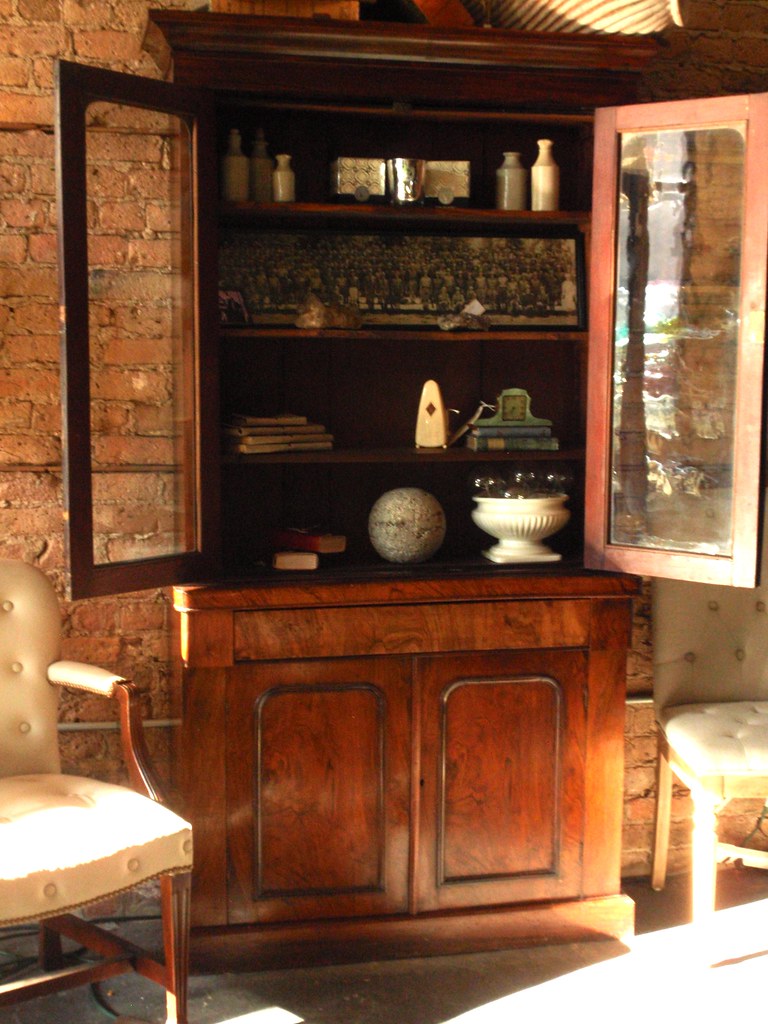
--even if the lamps are on timers and dinner comes in a cardboard box from Pizza Hut. Actually, I'm fine with both of those things:  I just pretend it's the servants' night off.  Anyway, that calm, settled, cozy look works just fine at home, so I decided to try to create the same atmosphere here in the shop.  I figure if I have to spend as many hours here as I do, then being here needs to feel as good to me as it does being at home, and since, after a year and a half,  I've made friends with a lot of our customers, it should feel good to them, too. After all, we're not the only antique shop in town: our customers can shop at a lot of other stores--and most of them do--but it's nice to go someplace where you feel you're more than just a name on an account, and if a shop has a place to sit down

 
and chill after a hard day of work (or shopping), well, it seems to me that that would be a good thing. So, in a few weeks, we're going to start staying open late one evening a week. Maybe I'll have some company, and maybe not. And if somebody does show up, maybe they'll buy something while they're here. Then again, maybe not. Maybe they'll have already spent all their money before they get here. Maybe we'll just sit around and talk about decorating. I don't know. I tend to do that anyway--talk about decorating--and most of my friends reached the saturation point a long time ago: they don't want to hear it. At any rate, I really have no idea what will happen, but I'm going to find out. This moody painting by Haddon Sundblom perfectly captures the relaxed vibe that I'm hoping to recreate in the back corner of the shop for the next month or two (or, at least, until somebody buys the bits & pieces, whichever comes first) although I don't want to give anyone false hopes:
 

that is, there will not be a private chef cooking steaks to order in our fireplace. That would be hard to do, since our fireplace in the shop is just a fake.  Beer, on the other hand, is on the Definite Maybe list. We'll see.

Tuesday, July 17, 2012

All Art is Copying


Picasso said those words--allegedly--but he was probably just repeating something he overheard at a party. Still, when it comes to copying others, Picasso ought to know better than most, since he often used others' work as a basis for his own paintings. Not, of course, that he was the only one to do that. Copying is as old as that cave in France.

Speaking of which--France--the woman in the charcoal portrait above is the Empress Josephine, and it's a lovely drawing: you can almost feel the downy softness of Jospehine's cheek, and I love the luster of her black pearl earring, but it's in fact a copy, taken from a tiny (but important) detail of Jacques Louis David's monumental painting of Napoleon placing the crown of Empress on his wife's submissively bowed head.


Technically, even that's not quite true. The image at the top above is a copy, all right, but it's actually five removes from the original painting, not one: that is, it's a computer scan of a charcoal sketch that was copied from an enlargement of a Xerox copy of a reduced halftone reproduction of the painting in an art history book. That's a lot of in-between steps, but I should know, because I'm the one who copied it: yes, that's my drawing above. What can I say? I'm good--as long as I'm copying a genius, which David clearly was.  With his weathervane politicking, I wouldn't trust the guy any farther than I would trust Picasso, but he was still a genius, and that's the secret to successful copying: picking the right model to copy.

Anyway, Josephine comes up because last Saturday we sold two matching sofas, a big rug, a massive table, a 1930s galvanized steel cart and a lamp, and all of it from the small area of the shop formerly known as the Castaing Corner.  Once again, the place looked stripped.


Naturally, I did what I always do when this happens: I called Debra. Unfortunately, there was a little problem with my timing this go-around. The good news was that Debra was already preparing to head down to Atlanta to restock anyway, but the bad news was that she wasn't going to be back to Chicago with new things for at least ten days, at which point I probably started muttering about looking picked-over again. So to shut me up, she told me she had two metal daybeds that she would drop off in Chicago before leaving town, which, she said, should hold me until she got back. That's all she said: there were two daybeds, and they were metal. Also, they had trundle gizmos underneath.

By now, of course, I should know to trust Debra's eye, but it had been a hot, miserable week, and the combination of the phrases "metal daybeds" & "trundle beds" sent visions of sugarplums dancing through my head, and not in a good way: white enamel curlicues, flouncy, bouncy pillows in bright-colored prints, and...slumber parties. Not, of course, that there's anything wrong with any of that, I suppose--if you're a nine-year old girl. All I know is I hardly slept that night for fear of what I'd find waiting in my store.


But I was worrying over nothing, because when I walked in last Tuesday morning, what greeted me was not your typical mass-market metal daybeds but a handsome pair of steel-&-brass campaign beds, which is another thing entirely. Better yet, these beauties were clearly patterned after similar steel-&-brass beds sold in the 1960s by Jansen, probably the greatest French decorating firm ever.


And Jansen's elegant beds were inspired by antique originals in the Directoire & Empire styles, which,  in turn, were modeled after the the kind of collapsible metal bed used by Napoleon during his military campaign in Egypt in the 1790s. Of course, the splendid rooms of Napoleon's palaces at Malmaison & Saint-Cloud were a long way from the spartan fittings of a military encampment, but Napoleon's in-house designers Percier & Fontaine made sure everybody got the message by a liberal use of military motifs in the sumptuous decor: silk drapery hung between gilt tent poles, gilt-tipped spears used as curtain rods, trophies, laurel wreaths, winged figures of Victory & draped beds with big round bolsters placed lenthwise against fabric panels.


Josephine--whose bedroom this is--probably never went camping in her life, but at Malmaison, she roughed it in a bedroom tented in gold-fringed red silk and open to a painted sky. Compared to the gorgeous splendor of Josephine's room, Napoleon's nearby bedroom was downright spartan, but even there, draped walls were still the room's main feature. So, when I found myself faced with a pair of early-Nineteenth Century style steel beds & a blank-walled corner, what could I do but follow suit?  


The problem, of course, was how to recreate the sophisticated vibe of Josephine's tented room at Malmaison without stepping over the line into Little Princess preciosity? Well, first off, no red. In some photos of Josephine's room, the fabric already looks dangerously close to Barbie-pink, so none of that. Also, nothing shiny. The campaign beds' steel frames are unpolished, with only a coat of wax to make sure they'll age naturally. So whatever I went with on the walls, it had to be in keeping with the mellow sheen of the beds' frames. Nothing glitzy here. 


Fortunately, I knew a room that had exactly the feel I was after: Millicent Rogers' tented New York living room of 1935: no shine to the fabric and, at least in the monochrome photo, no color--even though her actual room was red. What I liked best, though, was the informal draping of the heavy fabric as compared to the perfect swags at Malmaison. Of course, I had no fabric, heavy or otherwise, on hand, but that was nothing that a late-Saturday-night trip to Home Depot couldn't solve.

The two dropcloths I bought were stiff & full of stubborn wrinkles, but soaking them with Fire'z Off not only relaxed the wrinkles, it also made the draping the stiff cotton easy. By Sunday morning, the fabric had dried into crisp swags, and all that was left to do was trade Mme Castaing's turquoise-bead chandelier for one made of rope & rusted iron and hang Josephine's picture above the bed as a visual clue to the backstory for those attuned to such things.


Of course, it's not like I haven't been through the whole drill before: below is a shot of my great-grandmother's linen sheets pressed into service as summer curtains in my former apartment.  There's nothing like making-do. But hey, practice makes perfect. And as I always tell people who come to me when they find themselves stumped for decorating ideas: History has all the answers. All we have to do is look them up.


By the way, if you want to see this cozy little corner, please stop in, but do it soon. These beds only made their debut in their new setting on Sunday but they're already sold--presentation is everything--and at this point they're just waiting to be picked up, at which point, I'll be right back where I started, with a big hole on the floor. What can I say? The circle of life is a wonderful thing. 


Meanwhile, pleasant dreams. I'm beat.

Friday, June 22, 2012

Sanctuary

                                           Fourth Presbyterian Church on Michgan Avenue, by Moodygoat @ Flickriver 

In my list of favorite seasons, summer ranks dead last. Summer in the city ranks even lower. No free movies in the park, no Taste of Chicago, no fireworks can possibly compensate for the heat, the glare, the scorching pavements, the parks full of dead grass sharp enough to cut your feet. Not that complaining does any good. At least, this year (unlike last year) we're ready for the season--right out of the gate, on the very first day of


summer, meaning that even though it's hotter than blazes on treeless Grand Avenue, it's cool & dim & green here in the shop. The key to survival--for me--is having a fountain a few feet from my desk.


Sad to say, last summer's "fountain" was a pretty sad affair, cobbled together MacGyver- style on a moment's notice out of odds & ends--a terra cotta vase that I had knocked over & busted a perfect hole the size of a ping-pong ball out of, some plastic tubing, and a galvanized steel bricklayer's tool box that caught the water that poured--just barely--out of the vase. If you enlarge the picture above about 500%, you might actually be able to spot the stream of water. Fortunately--and it wasn't, I'm sorry to say, cleverness on my part--the thin-gauge metal box acted as a resonator to make the meager stream of water sound a lot bigger than it really was, but it still wasn't much. Not long after I got the thing running, a friend of mine happened to stop in, and when he saw my dubious expression, he stared at the setup for a minute, then gave me few words of encouragement: "Well, it's better than nothing." Now, there's a recommendation for you. But he was right, and that's all that could be said about it. Anyway, that was all last year.


This year, however, we've got the real thing: a handsome cast-stone fountain that's nearly as tall as I am, with four copper spouts that shoot streams of water into an octagaonal stone basin. It's got the heft & the overall look I was after, but even more important, it's got a good, full-throated splash. None of that trickly, gurgly, undersized nail-salon fountain nonsense--basically, that is, what I had last year. This year, it's all good. We aren't called SG Grand for nothing. Thank you, Debra.


The sound of constant splashing is refreshing on brutal days like we've had this week, and when you combine that with the sound of birds making a racket in the mulberry trees out back & the drone of the neighbor's lawnmower cruising past every once in a while and the barking of the dog down the block, well, the result is a very soothing environment, and a pretty convincing one, too even though it's all fake, produced entirely by robots. But that part's irrelevant. What matters is that the sound overrides your critical left brain trying to remind you that none of it's real, so much so that if you close your eyes, you'd swear you were out in the country, not in the middle of a former industrial district with hot winds blowing street grit around right outside the door. 

Not, of course, that I came up with the whole concept entirely on my own.  In fact, I borrowed it. OK, OK,  I stole it, and not just the general idea of a cool green sanctuary with a fountain, right in the middle of the city's noise & dirt, but also the fountain's specific form--the pillar, the multi-sided basin, the four jets of water, the whole thing--from another Chicago fountain a few miles away, but hey, it's all right. As Picasso said, All art is copying. A least I admit it.


At any rate, the beautiful photo at the top of the page shows another, prettier view of my model, the idyllic courtyard of Fourth Presbyterian Church, a century-old Chicago landmark that's located on a noisy stretch of Michigan Avenue, right across the street  from those other famous Chicago landmarks, Best Buy & The Cheesecake Factory, and sandwiched in between two retailers of women's fashions: Store A, where prices for dresses begin at $7, and Store B, where a single dress likely costs more than everything on the main floor of Store A, all put together.


But the church's physical proximity to those temples of Mammon is irrelevant. The serenity of the courtyard is what's important, and it feels a million miles--and a few centuries--away from all the hurly-burly.


Architect Howard Van Doren Shaw created a convincing pastiche of the enclosed garth of an ancient cathedral, with the carved limestone walls, steep-pitched slate roof & Tudor-style lead casements of the Manse on the south & west sides of the quadrangle, and to the north, the stained glass windows of the main sanctuary, designed by that master of the Gothic, Ralph Adams Cram.
A hundred years ago, when the church was built, the main function of the cloister's Gothic arches was aesthetic, because Michigan Avenue still stopped south of Chicago River and there was no such thing as "traffic" on what was then called Pine Street. Today, Shaw's arches serve a thoroughly practical purpose: they help block the steady whoosh of tires on hot asphalt. So, of course, does the sound of splashing water from the fountain.

And when the wind rustles the ivy on the walls & the leaves of the trees, it's almost like being in the cathedral close. One morning a few weeks ago--back before the weather turned beastly hot--I stopped in to take a few pictures, and there, in a shady corner of the courtyard, was a young woman quietly reading to a little kid in a stroller. Up a few steps, under the groined arches of the cloister, was a guy playing the flute. The place was like The Garden of Earthly Delights. But the spell didn't last long, When two girls in flips-flops shuffled in, chattering away on their cell phones, I knew it was time for me to go back to work. Even so--and even riding the Grand Avenue bus to the shop--the feeling stuck with me.


Anyway, so that atmosphere of calm-amid-chaos was what I was hoping to re-create and what I tried to focus on, the morning that we wrangled the shop's new fountain into its spot for summer. By the way, it took four guys to load this beast onto the truck, but --somehow--Steve & I managed to unload it and put it together all by ourselves. And just in time, too: in this, the first official week of Summer, we've already had near-record temperatures.  Do come in and check it out if you happen to be A) in the neighborhood--and B) hot.
Fortunately--for Chicago, anyway--the miserably hot weather of the last few days broke last night and headed out east, where Charlotte Moss demonstrates The Best Way to Stay Cool: let other people take care of the actual installation, then show up in a cool outfit and play in the water.  Works for me. There are, of course, other ways of staying cool, some of which involve alcohol. Those ways also work for me, and they have the added advantage of not causing smashed fingers, which I cannot say of the fountain. 

What's your way to stay cool?

Aubrey Beardsley


Tuesday, May 29, 2012

Wanna Be Green? Buy Antique


The other day Chicago designer Brion Judge stopped into the shop, and since Tuesday mornings are typically pretty quiet, we had a chance to sit around and talk. That's one of the nice parts about this job: sofas and pillows and--if I haven't drunk all the Pepsi, myself--being able to offer a cold drink on a hot day. Anyway, after we got to talking, we discovered that we have a lot in common. Like me, Brion A) is a Chicago transplant,  B) has a traditional approach to design (which viewpoint was considered heretical at C) the design school we both attended, the entity formerly known as the Harrington Institute of Interior Design,) and D) he's been wearing horn-rim glasses for years, too. Of course, a lot of designers have horn-rims these days but I've been wearing them--in style & out, although mostly out--for almost forty years now, ever since the summer of the Watergate hearings. I was the only art major in history whose sartorial role model was John Dean. 

Anyway, so when they make the movie of my life, Brion is now shortlisted to play me. I used to have either Matt Damon or Dean Cain in mind--at least for the flashback scenes
--but now I'm starting to think that leaving the casting up to the producers is just asking for trouble, so maybe it's best to go for local talent.

Besides having nearly-identical glasses, Brion & I also found out we have similar thoughts about the "Green" movement: not that, deep down, it's not a good thing, but that so much of what's out there is nothing but empty marketing hype. The truth is, no matter how natural or environmentally-friendly or how recyclable (or recycled) a new product is, the greenest choice of all is often leaving well enough alone. Don't get me wrong: I happen to love linoleum--real linoleum, that is. It's made from all-natural ingredients and given
enough time, it's totally biodegradable. So that's good. And a while back, I saw a brand-new solid-surface material made out of recycled newsprint. It doesn't sound all that exciting but it was pretty good-looking, even if, given the troubles at a lot of newspapers these days, newsprint seems like an endangered resource. But here's the thing: both of those products still have to be manufactured--their raw materials harvested or collected, then transported to the factory, then fabricated, then shipped to the job site to replace the perfectly serviceable (but ugly) mauve laminate or hunter green marble countertops being torn out & broken up &  hauled--expensively--away. Not quite as green as it first appears, you know?  Specious environmental claims are everywhere nowadays but the way that we furnish our homes generally reveals just how green we truly are. A letter-to-the-editor that I cut out of the Chicago Tribune a few years ago makes an excellent point for those conscious of their own environmental impact.

Until sitting on bamboo mats becomes mainstream, we all need furniture, but it's still possible to furnish & decorate our homes with stuff with zero impact on our physical world. That's the great thing about antiques: whatever environmental toll accrued from cutting the walnut tree that went into my 1840s bed, or grazing the sheep whose wool became my 1890s Persian rug, or feeding the silkworms that supplied my 1920 curtains was already paid a long, long time ago. And that's not all. Buying old stuff is often a hell of a lot cheaper than buying new. For the same price as a glued-up-sawdust-&-plastic dresser from Walmart, I went to Goodwill & got a hand-carved 1920s Louis XVI-style dresser with a figured marble top & gilt-bronze hardware. Guess which piece will end up in a landfill first. Wanna be green? Buy old. 


Words to live by, and I'd say that even if I hadn't written those words myself, back in the giddy, booming summer of 2007, the year before the economy fell off a cliff & four years before I switched from buying antiques to selling them. My timing could have been better.

Besides the environmental & economic benefits, there's also a solid, practical advantage to buying antiques, and especially if you have children. If a piece has already survived a couple of hundred years, it will probably survive a couple of rowdy kids. The top of a chunky Portuguese table from the 18th Century will laugh at the kind of dents & gouges that would destroy the micro-thin veneers & synthetic finish of a new table from the mall. Another coat of wax--real wax, rubbed in & buffed, not that spray stuff in the yellow can--and an old piece like this is ready for another go-round. I had a bored-looking kid in here with his mom over the weekend and when I told him how old this table was, he just started at me for a minute and then asked "Do you think...pirates...ate at this table?"  Every night, kid. Every night.


Which brings me to the self-serving reason for encouraging people to buy & use antiques: if kids aren't exposed to old things on a daily basis when they're young, if all they've ever known are paper plates & plastic chairs, they're not going to suddenly start buying bone-handled flatware and Royal Doutlton and Portuguese pirate tables once they're out on their own. That's why I always tell people to bring their children the next time they come in: those kids are tomorrow's customers. It's never too early--nor too late--to get 'em started. Ahoy! Dinner's served, matey! 

Who says antiques are only for tea parties?
----------------------------------------------------------------------------------------------------------------------------------------------------------------------------------------------------------------
 Meanwhile, back in civilization with the grown-ups...

* When They Make the Movie of My Life, performed by the wonderful Susan Werner

Photo of Susan Werner--susanwerner.com

And if you're already as big a fan of Susan's as I am, don't miss her show September 24
Photo by Michelle Conceison
at the most gorgeous--and biggest!--cabaret in town, the stage of the Auditorium Theatre of Roosevelt University. Buy your tickets here.  You can guarantee that I'll be there, so come on over to my table and say hi-- I'll be the guy in horn rims drinking a sidecar.

Friday, May 11, 2012

What would MacGyver do?

(A chin-strap free post)


I had it all figured out. Or, at least, I thought I did. In late March, the shop was looking really good, but then, all of a sudden, right about tax time, we sold a ton of stuff in a short time frame--big pieces, things with lots of presence--and within the space of a few days, the place went from being ready for its closeup to looking sort of sad & picked-over, with awkward blank spots on the walls and holes on the floor.

Selling things is great but looking picked-over isn't, especially not with a group of antique collectors & dealers & decorators from all over the place coming to Chicago at the end of April for the big Antiques Show at the Merchandise Mart. Those people spend a day or two at the Mart, then they fan out to hit all the locals, and if you ever want to see a hyper-critical group, one that knows exactly what it's looking at--or what it's not looking at, despite what a tag may claim--feast your eyes on these folks. 


So while a big sale is always good, when things start moving faster than I can replace them, I get nervous, especially with these guys around. The last thing I need is a photo of a suddenly-empty shelf or a denuded tabletop that's posted on somebody's blog to visually define us online. I can hear it now. "Well, that place doesn't have much of anything." So as soon as the sold pieces went out the front door--and this was less than a week before the Mart show--I was on the phone to Debra: SEND MORE STUFF.

She must have caught the desperation in my voice because two days later she came through with a handsome pair of pale club chairs with nailhead trim, a French gray Empire-style sideboard with a Greek-key frieze & a cool vintage roulette wheel (or, at least, something close) turned into a mirror. Unfortunately, handsome as the pieces were individually, once I put them together in their intended spot in the back of the shop, they looked like absolutely nothing, bland & colorless. Now what? Time was short.
    

Worse, thanks to the creepy premature spring this year, Debra had already been working full-tilt with her long-term garden clients for weeks, and therefore had no time to make another trip into town, meaning there was no hope of getting different pieces. Not before the Mart's show, anyway. So I had to come up with a solution for the boring corner that didn't involve heavy lifting, but still, something that would make a big impact. And, of course, something both fast & cheap. And, preferably, easy. I racked my brain trying to think of a clever, quick fix for that corner. I asked myself: what would MacGyver do?

Of course, I had no five-gallon water bottles just sitting around, the way MacGyver did, although I'm not sure what good they would have been, anyway, even if I had some. But I kept thinking, and eventually, I came up with a plan to Save the Back Corner. 

I would paint the sideboard black to give some value contrast, paint the back wall the same red as the lines on the mirror to provide some color, move the pair of cast-iron urns from the front of the shop to the back wall, and trade the rug for a shaggier (and, more importantly, paler) one to balance the darker, heavier tones of the wall, floor & sideboard. I couldn't do any actual painting yet, but I mixed up a sample of the red I wanted out of some sample jars of paint I found under under the sink, figuring that I could stop on my way into the shop in the morning to get my sample matched at the Benjamin Moore dealer near my place. With three days to go, it would be easy.
   

Wrong. The very next morning, before I could even get the wall painted--mostly because I had been running late and hadn't had time to stop at the paint store--a designer came in and bought the chairs. Great. I asked her if we could keep them until Monday--that is, until the end of the show--but noooo, the client needed them ASAP. Fine. So I not only didn't make any progress on finishing the area, I was now actually going backwards. First I had no paint, now I had no chairs, and by this time, I was down to only two days until all the out-of towners-show up at the door to critique that corner.  

I made another panicked call to Debra and explained that the chairs she had just sent me were already gone, and the bad news from her end was that there were no more chairs to be had--none, at least, that would work with what I had in mind--but there was a sofa in Geneva: a match, in fact, for the cocoa brown sofa that I already had in the shop. So now I'd have a pair of them. That wasn't really what I had had in mind for the corner, but there was no time to waste, so I told her I'd take it and she promised to send Steve down with it in the truck. But not until the next day. That meant I'd only have one day to get it all together.

When it arrived, I realized that three big, dark pieces in such a small area was no better than three big, pale pieces, so that painting the cabinet dark was now out of the question--even if I'd had the paint, which I didn't. But that was OK because I was running out of time, anyway. And I still had the wall to paint. But what color? OK, so red was now out, but how about Hollandaise Yellow, or Lettuce Green? You can't go wrong with food colors, right?  I figured I'd still have time in the morning to make a final decision on the color. 

On the bus ride home, I was looking at my calendar when suddenly, the pieces all fell into place. How could I have missed the obvious answer to the color question when it had been staring me in the face all along?

On Saturday afternoon, I was supposed to go to the Mart to hear my friend Emily Evans Eerdmans talk about the subject of her latest book, the French decorator Madeleine Castaing. So why in the world was I worrying about what MacGyver would do? The real question, when faced with that mediocre corner, was What would Madeleine Castaing do? 

interestingly, the answers to both questions involve tape. And, in Madame Castaings's case, pins, lots of pins. Straight pins. Madame Castaing never bothered sewing the fringes on her beautiful Directoire-style curtains, so for decades, they were merely pinned in place. MC's & MacGyver's approach to things had more in common than most people realize.


Personally, I've found that a stapler works better--it's faster, not to mention that it means fewer stuck fingers in years to come--but, thanks to EEE's inspiration, this corner now would be an homage to MC--not to me--so straight pins it is. Meaning the fringe on the big fabric panel of Joseph Hoffman's lustrous & colorful "Design 9297" of 1913--currently back in production as part of Maharam's "Textiles of the 20th Century" line--is attached with a welter of straight pins that are clearly visible. I angled them just so, to catch the light so that people would realize they're supposed to be that way. And the whole panel is just pinned up on the wall with gigantic push pins.


Debra wasn't entirely convinced that that anybody would get my little joke, but I figured that if any crowd would get it, it would be the one coming to town the next day. But just to make sure, I displayed Emily's book on a brass easel on a sofa right next to the grouping. And as it, turned out, a lot of people got the reference before they even noticed the book. What can I say? We have a pretty smart customer base. And for those who had never heard of MC before, well, it was like a little Decorating History lesson.

Anyway, Madame Castaing had superb taste but she wasn't a slave to petty middle-class notions of "perfection", so one of her rooms might also include furniture with ebonized finishes that were, let's just say, less-than-pristine, plus unstylish Nineteenth Century engravings in gilt frames,  water-streaked walls in the elusive blue-green that's now known as Castaing Blue, plus opaline glass lamps with coolie shades,


and masses of blatantly artificial greenery. MC didn't like real plants and flowers indoors because they had a tendency to die on her, a phenomenon that I, myself, am all too familiar with. Debra shows up with beautiful plants in interesting pots and I do my best to sell them before I kill them. Sometimes I succeed, sometimes I don't. Oh, well. As I told Debra, if she wanted a plant guy to run the shop, she should have hired one: she hired an antiques guy.

At any rate, the "plant" I cobbled together for the Castaing Corner is nothing but a bunch of shiny plastic industrial strapping tape that was lying on the ground by the dumpster out back. Waste not, want not, and I have no doubt at all that MC would thoroughly approve the casual, makeshift nature of it all.


True, the leaves' lurid green & slick surface may not resemble anything found in nature, but then neither did MC's wig*, and the leaves at least have the advantage of a very realistic heft & a graceful arch. Beauty is wherever you find it.

Oh, and that vibrant paper border in the blue bowl above, the one that that looks--if you don't examine it too closely--like "Bordure Pompei/Lola Montez", which MC used to trim the walls of the salon of her house at Leves?  Well, that's actually a Greek design out of
   
Photo by Rene Stoeltie
Owen Jones' classic 1856 reference book "The Grammar of Ornament", which design I scanned, turned into a repeating design, recolored a la Castaing and printed on my computer, which promptly ran out of blue ink. That's why the border only runs partway across the tops of the painted panels here in the shop. You know what I say to that?


Oh, well. The Venus de Milo stands in a grand gallery in the Louvre without any arms and the Nike of Samothrace is missing her head, but they're no less beautiful for any of that.  Let's face it, we all have issues, but why make ourselves crazy pining for what we don't have, or wishing things were otherwise than they are? 

Speaking of which: the dark line around the sides of the walls' panels?  It's nothing but regular painters' tape that I painted gray before I stuck it up there, and after only ten days, it's already coming loose at the top. But that's OK, too, because in a week or so, I'm getting a big fountain for the middle of the shop, at which time everything else has to move around again, anyway.


In other words, the Castaing Corner's days are already numbered, but it was fun while it lasted, and I'm glad I could share it before it vanishes. Who says antiques have to be serious all the time?
* I said this would be a chin-strap-free post, not a wig-free post. There's a difference.

And if you noticed that one of the pale chairs seems to have come back, you're right. After I had already come up with--and installed--Plan B because somebody needed both chairs, the client decided she only needed one after all.  It's always something.  Have a good weekend.

Thursday, March 1, 2012

WHAT IS BART WEARING?

(with obvious debt to James Andrew & his must-read blog What is James Wearing?)

What is Bart wearing? Well, it sure as hell isn't (the liturgical calendar notwithstanding) sackcloth & ashes. That is, it isn't gray--or heaven forbid--greige. I don't do drab, not in clothes, not in rooms.

Debra  (and that's Debra Phillips, the owner of SG Grand and the blogger behind 5thandState, for anybody new to the blog)--wrote a great post the other day in which she used the word "dour" to describe the color-deprived Belgian look that, in the last few seasons, has washed across the decorating landscape like dirty water from an overturned mop bucket. After a decade of allegedly Tuscan reds & golds, the pale, all-gray look looked fresh when it was new--well, at least, as fresh as something inherently dingy can be--but enough's enough, you know?


Depending on who you listen to, the human eye can see somewhere between 7,000,000 colors and 90,000,000. Either way, that's a lot of colors, so why, all of a sudden, did so many people gravitate to the neutrality of gray? Was just because gray seemed to be an easy choice? After all, everybody knows what happens if you toss a jumbo-size box of crayons into a blender. No? Well, I'll tell you what happens: all the pretty colors cancel each other out & you end up with big glob of dark, dry sludge, sort of like oily gray cookie dough, or damp, ground-up shale. If you were like me, you also ended up with a wrecked blender, a trip to your room with no supper & all your paper route tips confiscated for a month, but that's another post. This post is about color, not science experiments gone wrong. The take-away lesson, however, is the same: that all colors mixed together blend to make gray. Remember that: it will be on the quiz.

Anyway, after Debra's post about color and about how ready she is for a little levity, I figure it's safe for me to come out as a closet colorist, too--not that some people haven't always suspected as much, especially if they've ever snooped in my sock drawer.


When it comes to argyles, the more lurid their colors, and the more strident their combinations, the better I like 'em. Not, of course, that argyles the only kind of socks I own: I also have a pair of solid black ones, in case of emergency. I wasn't a Boy Scout for nothing, you know.

Anyway, color is good, and if you're as bored with the lack of color in current interiors as Debra & I are, but from lack of experience, you don't know where to find ideas on how to combine old colors in a fresh way (and, despite what the Pantone people will tell you, there are no new colors) all you have to do is take a good look around. In the real world, I mean, not online. Or not only online. Sure, there are countless blogs full of pretty pictures of rooms that you could copy, but why restrict yourself to hand-me-down notions of beauty? Don't get me wrong: Canadian sunsets & Indian spice markets & gardens in the tropics are great, but you can find color inspiration a lot closer than that, and in places you might not expect. How about the parking garage at the mall?


But you don't have to drive. Color ideas are everywhere--even in your neglected yard.
In fact, you don't even need to get dressed--just look in your closet. Remember that bit about how all colors blend to make gray? Well, here's proof:-a closeup of the vintage jacket I'm wearing in the top photo. In this optically-blended mix--think Pointillism--dozens of colors mix to create a neutral fabric that has a vibrancy & liveliness that no solid gray fabric could ever approach. The fabric was hand-woven by P. Carr for Magee of Donegal, and no matter what else I've got on, if I wear this, everything else falls into place.


This fabric is also a good example of a useful approach for those venturing out of neutral territory for the first time: the more colors a room already contains, the more colors it can accept, whereas a narrow, too-thought-out scheme doesn't allow much leeway if you should stumble--and you will--across an unexpected find that you love, but that doesn't, you know, match. It's a big, wide wonderful world of color out there. Don't box yourself in with an overly constrictive color scheme.
--------------
So far, even though we're planning on moving the shop in a more colorful direction, Debra's still forbidding me to recover the handsome settee at the top in heavy watermelon-pink linen, but that's OK: I have a Plan B. Meanwhile, watch this space.