
The other day a woman stopped by to check out our gray walls. She's tired of the look of her living room and when she told her daughter she was thinking of going gray, the daughter suggested a trip down to Grand Avenue to see our "absolutely perfect gray". Why, thank you. Except that when the woman walked in, I was up on a ladder, painting over the very color she had come to see. "But why?" she asked. "I thought gray was getting to be pretty popular!" Exactly.

When Debra hired me back in 2010, our walls were painted Sheetrock White. OK, that wasn't the actual color actual name, just what it looked like on the walls: nothing. All the cool pieces that Debra had found were dying against the bland background, so my first order of business was to change that background. I went with dark gray instead. Much better.

Actually, the "new" paint color was a fairly easy choice: I just re-used the same shade of gray that I had used thirty-five years before, when I moved into my very first post-college apartment.

One of the reasons I took the apartment in the first place was that, although the place was dirty, it still had its original glass block walls, terrazzo floors and twelve-foot-wide enameled steel Venetian blinds. I couldn't have afforded to replace the blinds--even if I wanted to, which I didn't--so I had their glossy gray finish custom-matched by Elmer, the old guy at my neighborhood Benjamin Moore store. There's a hard way to do things and an easy way. I chose the easy way: I let Elmer do it.

The building had been a tony address when it was new in 1940, and its apartments' spacious dimensions turned out to be a drawback. What little furniture I owned looked totally lost in the big rooms, so I used paint & dim light to create the illusion of warmth & intimacy where there was neither. Dark gray & I go way back.

And although my handsome gray walls matched the blinds, they somehow had a depth & liveliness that the blinds didn't have. Of course, in the dark ages before HGTV turned everyone into a design authority, nobody ever had heard of full-spectrum paint, but that's probably what I got from Elmer, who matched anything you gave him


I stuck with the gray, even after the place started filling up with antique furniture, and when I moved to my next place--the upstairs of a big Victorian house--I painted my bedroom the same gray as that first apartment. Why mess with success?

And ten years later, when I moved to an apartment in Chicago--a 1950 high-rise overlooking Lincoln Park and Lake Michigan--I went all-gray again. This time I matched the steely color of the lake in winter. So I have no problem with gray.

So why, then--my visitor to the shop wanted to know--if I liked the color, and it looked good in the shop, was I getting rid of it? I couldn't argue with her about its looking good in the shop. It did look good. Really good. But here's the thing:

six weeks after I painted the shop gray, a mass-market store lately known for its overscaled furniture and its equally overscaled catalogs painted their store what's basically the same color, so, after people started asking me "Is this Restoration Hardware 'Slate'?"--and it's not, but there's no point being coy or making people guess--I started giving out hand-painted samples of our color. That way, those who liked it could take it to their own paint store and have it matched. After all, there's more to being a merchant than just selling stuff. A hundred-odd years ago, Marshall Field started serving home-made chicken pot pies to lady customers faint with hunger after a morning of hard shopping. I'm no cook, so I'm not about to do that, but I can paint and hand out paint samples. Whatever it takes.

These days, of course, that's hardly even necessary, because dark gray walls are everywhere you look. And while, in principle, I have no problem with copying--either my own, or others'--I hate it when new customers think that I've copied the shop right across the street--or the one two doors east of us. I sure hope my color sources aren't that obvious. Fortunately, inspiration is all around us.

Anyway, since, after a few years, I've become bored with this no-color palette- ( which, if I get to missing it, I can still see, simply by looking in the gutter out front)


Green River by artist Stacy Bogan.
I cannot seem to commit so my walls are Builder's White...actual Builder's White. *sigh*
ReplyDeleteI always wondered if the fish turned green on St. Patrick's Day?
Lots of inspiration in this post.
Andie
Thanks for commenting, Andie. I don't know that I'd say I've ever 'committed' myself to a paint color, either. In fact, when it comes to my house, rather than impose a pre-determined scheme, I tend to go with the flow and do what the house seems to want. Besides, what matters is the overall picture, not any single piece of the puzzle, so if one aspect of a room comes out a little bit different than what I was expecting--oh, well. The secret to contentment is setting one's standards low.
ReplyDeleteBut speaking of going with the flow, I read in the paper the other day that everything in the rives turns green, and that must include the fish. Cool. You could serve an all-green dinner that day!
Love,love the green! I think for a shop it's important to stay fresh so makes total sense to me.
ReplyDeleteThanks, Stefan. I love it too. I had eight or nine open paint cans on my desk--none of the greens the right shade, plus Yves Klein Blue, Screaming Mimi Yellow, black & red--and I just kept dipping my brush into different cans and painting out a swipe of the resulting color, until I came up with a green I liked. Elmer the Magician is lone gone, so I took my sample to Benjamin Moore and had them mix up a quart for me. Bingo! Magnaverde Green! Now I have to keep an eye out for more Japonesque pieces, some mahogany and a bunch of Coalport or Derby porcelain in bright colors plus gold. Wish me luck!
ReplyDeleteI'm writing this in my office that decorated almost 25 years ago. The walls are upholstered in green that was to have been hunter but arrived looking more peacock. I stippled the trim in a light blue/green and glazed with a dark blue green and it still amuses me.
ReplyDeleteIn my downstairs remodel I wanted a green for the ceiling for the 53' long room that is home to kitchen and library/dining room. It took me 12 samples of green (one young apprentice saw the ceiling with its green patches and said, "Dude, you're going camo!". I longed for Elmer...but B. Moore's Hillside Green was the choice. Still love it. Green is a living neutral. Love it. Gray makes me break out in hives.
HBD, your green office sounds really handsome, and now that you've seen my place[s], it might be nice for us to see yours, since, over the years, your fans (myself included) have had only tantalizing bits of descriptions of one or another aspect of your house. I can't be the only one who's wished that we had more than words to go by.
DeleteI think you & I first met officially--online, anyway--four years ago, when, under the nom de web Magnaverde, I wrote a couple of guest posts about the Chicago decorator Rue Winterbotham Carpenter for Emily Evans Eerdmans' most excellent blog,
http://emilyevanseerdmans.blogspot.com/2009/07/magnaverde-unveils-rue-winterbotham.html
and you were the very first person to respond. Thank you for your kind (and heartfelt) comment then, and thanks for taking the time to add a comment to today's post. I have to say I really miss the amazingly articulate discussions that used to happen on a regular basis in the commments section over at EEE's blog, An Aesthete's Lament & Mrs Blandings back in the day--sometimes, simultaneously, with references and links back-&-forth like the secret passages between the Kitchen & the Study in the the game CLUE. There were times that I could hardly keep up with all the smart talk, and your sharp comments were always right there in the thick of it all. Often, what you had to say wasn't a lot different from what I was saying, but your comments were generally more lucid than my scattershot fusillade.
I had a grey kitchen YEARS ago. People were shocked. I loved it. Now it's everywhere so it's lost it's luster for me. Not to mention the older I get these winters get a little bit harder to keep one's spirits bright. Farrow and Ball has the most beautiful greens. Wish they didn't cost an arm and a leg to get over here. I can't wait to see your end result.
ReplyDeleteYou're right, Kathleen: Farrow & Ball has some mighty fine greens. But the price they charge for their paint--sure, it's good stuff, plus it's a cinch going on--isn't the only drawback. In Chicago, the F&B store is inside the Merchandise Mart, which is peachy if it's Thurday morning, but good luck if you run out on Saturday night. That's what happened to a guy I know. He was only half-finished with his book room when he realized he wasn't going to make it back to Go, so he grabbed a pair of dark glasses, called out to the little woman that he was going out for ice cream, then cabbed it down to the Big Orange Store. He pushed the dried paint stick across the counter and gave the clerk a silent nod. The clerk knew the drill.
DeleteHalf an hour later, my pal was back home, ice cream in hand, with no one the wiser but the cabbie, and he won't talk: my pal happens to know the cab's license isn't the real deal, either--and the cabbie knows he knows. We've all got secrets. My advice? Don't ask, don't tell.
I WANT that Magnaverde green! Just what I've been looking for my hall after visiting the Colefax and Fowler showroom for the Rex Whistler exhibition. Do you think it will work even if the light is low?
ReplyDeleteHow touching you gave out hand-painted samples of your gray. That's real generosity.
Rosie, the real inspiration for that Magnaverde Green was not really--Stacy Bogan's cool painting notwithstanding--our green-dyed Chicago River, but the perfect 1930s green that I copied (considerably juiced up, considering its commercial application here in the store) from Diana Cooper's London flat with its Rex Whistler trophy murals. The whole range of period greens from Eau de Nil to the color of the beauty parlor walls in The Wizard of Oz has always been one of my favorites, and I'm just glad--finally--to be put it to public use. And yes, it's just as good looking in dim light. The key to getting a good effect at night is using clear incandescant bulbs, to give well-defined pools of lamplight.
DeleteSpeaking of which, here's another great green room of the 1930s, the New York library of Mrs. Samuel Barlow, as painted by one of my favorite artists of the era, Pierre Brissaud:
http://media-cache-ec3.pinterest.com/236x/b5/b0/1e/b5b01e9336a119af5fb8981f0a4e4add.jpg
clear incandescant bulbs, so a Rex Whistler scheme(well from from realy 's really my river notwithstanding looks just as good at nightyou email me your actual addresend me your
Bravo dahhling! enjoyed reading your post. So true about inspiration, "copying" others & the truth of what one likes & why. I have always liked a particular shade of pink that has followed me to this day from one house to another. Luckily "my pink" has not become the rage everywhere.. yet!
ReplyDeleteDuchess, my rule for escaping being exposed as a shameless copycat is never to take my inspiration for a room straight. My former dining room's brill1ant yellow came not off a paint chart but a wrapper of Juicy Fruit gum, and the unexpectedly handsome ochre-red-black-&-aqua color scheme of some friends' sun room came ready-made from a scrap of shredded-foam carpet padding that had I picked out of a dumpster in the alley half a dozen years earlier. Whatever it takes.
DeleteBravo! I'm so ready for an antidote to the greiges of the current design scene. Not that I don't like grey/beige, it's like you say.. everywhere. Your lovely new shade is like waking up to spring.
ReplyDeleteKeri
Thanks for stopping by, Keri. I've already handed out half a dozen samples painted on the back of our business cards, and I should do some more before Saturday. It didn't have a name before, but thanks to Rosie, it's now Magnaverde green. Why didn't I think of that?
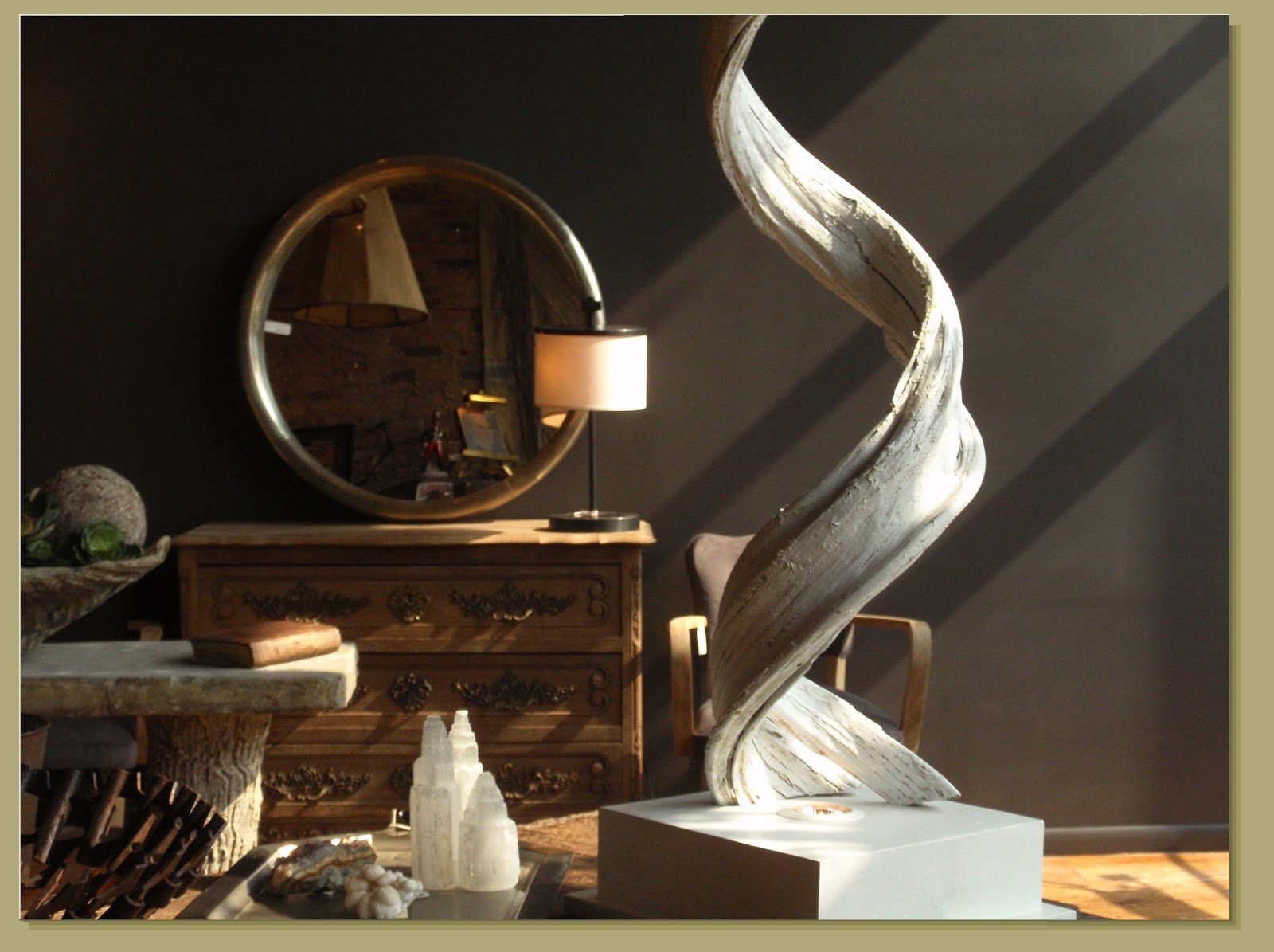
DeleteI love the carpenter table with the press and all decorations on it, love the mirror as well and of course the color off the wall -Well-done!
ReplyDeleteNow I´m looking for a similar table for myself, I already have the iron press, similar mirror but I going to decorate differently. Thank you for the inspiration,
Sara
Sara, when that workbench arrived, it had been given multiple coats of shiny brown polyurethane. Imagine a gallon of maple syrup poured over the whole thing: that's what it looked like, and it took a week of superfine steel wool, denatured alcohol and a lot of rubbing to get it all off. I hope that when you find your own table, you won't have to go through all that.
DeleteAnyway, thanks for your comment. That's the best part about finding inspiration: unlike whatever specific pieces you may be looking for at any given time, inspiration is everywhere -- and it's free!
Thanks for the link :) Lovely blog!
ReplyDeleteYou are so welcome, Stacy. Your beautiful painting is hanging at the entry to my kitchen, where it always reminds me of my former job running a contract furniture showroom that opened directly onto the Chicago River.
ReplyDeletehttp://media-cache-ak0.pinimg.com/originals/ac/be/f3/acbef34d682af7404b95b88c811a56bc.jpg
We had our own balcony overlooking the water and I'd sit out there and eat my lunch on breezy days. Then I'd wait and watch for the gulls to fly down the river, and when they got close, I'd toss the crusts of my sandwich high into the air, then watch the gulls swoop & dive down to catch them mid-air. Finally I got them trained to come by right at 1PM every day. After a while, though, if I got busy with a customer or was on the phone at their designated lunch hour, I'd look out the windows and see them circling & waiting for me.